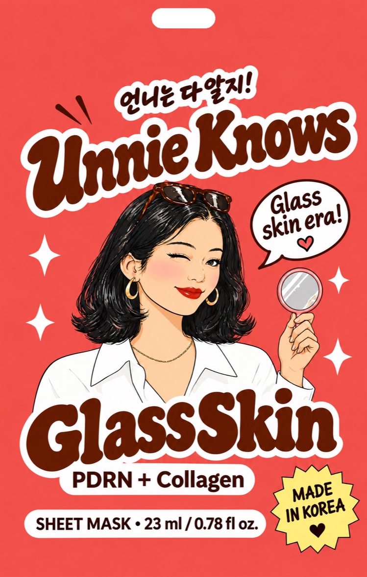
Glass Skin
PDRN + Collagen“Glass skin era!”
Plump, bouncy, glassy. Lit from within in 20 minutes.
언니 un·nie, noun big sister; the one you trust.
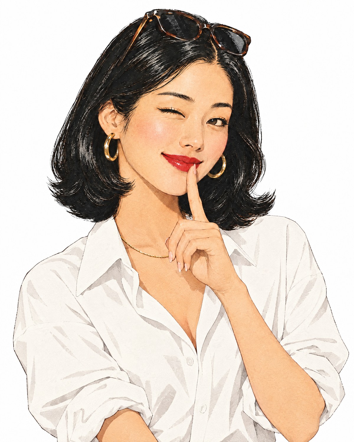
Some things you ask Mom. Skincare, you ask Unnie. She has tried everything in Seoul, reads ingredient lists for fun, and tells her little sister what’s worth it. Every touchpoint should feel like advice from her.
The ingredients Seoul is talking about now: PDRN, rice, ceramides, peptides.
Plain benefits on the front, a tip on the back. No jargon walls.
Good ingredients, made in Korea, no splurge required.
“The character sells the trial; the ingredient earns the repeat.”The brand’s working rule: Unnie gets you to pick it up, the formula makes you come back.
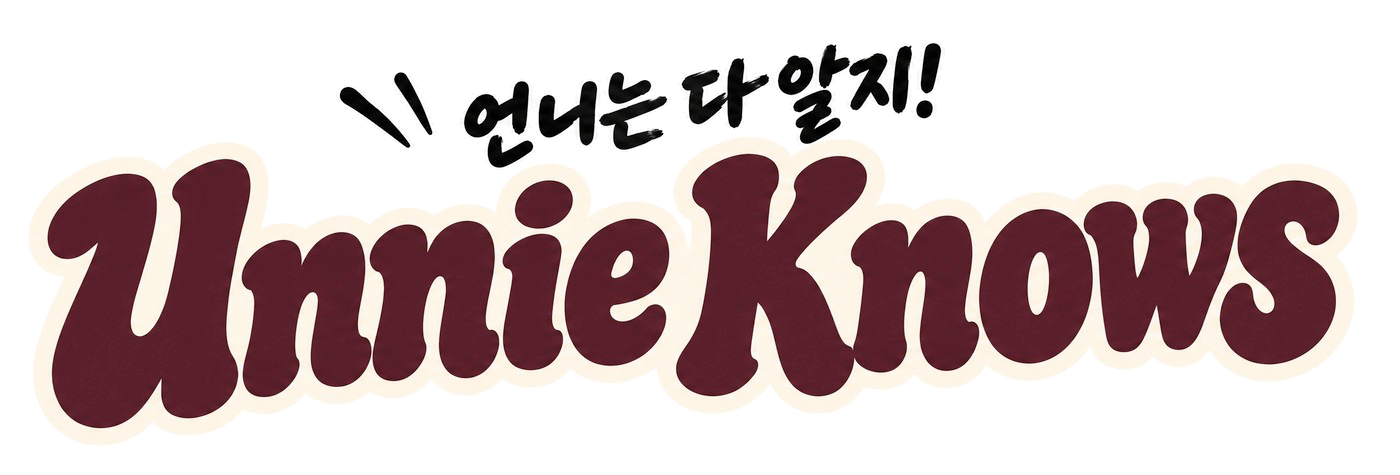
A hand-lettered retro wordmark with the Korean tagline 언니는 다 알지! (“Unnie knows it all!”). The lettering is custom: never retype it in a font.
Wordmark · Unnie Wine
Cream keyline
Tagline and wordmark always travel together. The tagline sits top-left with its three “spark” strokes.
The cream outline lets the logo sit on any pouch color. Keep it on light and mid-tone backgrounds.
Below the minimum size, use the wordmark-free “언니” seal or a pouch thumbnail instead of shrinking the logo.
unnie-knows-logo-full-color.pngDefault. Cream, pouch colors, light photos.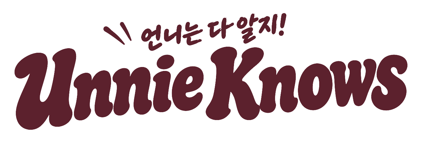
unnie-knows-logo-wine.pngClean layouts, stationery, embossing.
unnie-knows-logo-cream.pngAny dark background: wine, ink, deep purple.
unnie-knows-logo-black.pngSingle-ink print, retailer forms, fax-grade.
x is the height of the tagline line (언니는 다 알지!). Keep that much empty space on every side.
120 px wide. Below that the tagline breaks up.
1 in / 25 mm wide.
Don’tstretch or squash it.
Don’trecolor it outside the four versions.
Don’tuse full color on dark. The black tagline disappears; use the cream version.
Don’tadd glows, gradients or extra shadows.
Don’ttilt it. Tilt the sticker around it instead.
Don’tretype the name in a font as a logo.
Cream pages, wine ink, and the four pouch colors. The pouches are the loudest thing in any layout; everything else stays calm around them. Tap a code to copy it.
Base values are sampled from the November 2026 print files for screen use. Final Pantone and CMYK values must come from the packaging print files.
Product colors 20% (one per SKU, never mixed inside one product’s layout) · Coral Pop + Butter 5%.
| Text on background | Ratio | Use for |
|---|---|---|
| Ink on Cream | 14.4 | Everything |
| White on Wine | 12.3 | Everything |
| Ink on Butter | 11.3 | Everything |
| Ink on Coral (buttons) | 5.3 | Buttons, labels, body text |
| Ink on Blue Ink on Lime | 6.6 to 9.7 | Pills, labels, body text |
| Ink on Purple | 4.3 | Bold labels and large text only |
| White on Purple Deep (and the other Deeps) | 4.7 to 4.9 | Body text and up |
| White on Coral Pop | 3.6 | Large text only. Not for buttons. |
| Coral Pop on Cream | 3.3 | Headlines and script lines only |
A soft, chunky serif for headlines, a friendly sans for reading, and a script for Unnie’s voice. All four are free Google Fonts (Open Font License), so agencies and retail partners can use them without a license.
Fraunces
Weight 800 to 900, “Soft” 100 and “Wonk” 1 for the retro, ink-spread look. Tight leading (1.0 to 1.1).
DM Sans
Weights 400, 500, 700. Body at 16 to 18 px, line height 1.55. Labels in 700, uppercase, letter-spacing 0.18 em.
Yellowtail
Only for short Unnie lines: “So juicy.”, “xo, Unnie”. Five words at most. Never for body copy or anything someone needs to read twice.
언니는 다 알지
Noto Serif KR, weight 700 to 900. For Korean words set in digital layouts. The pouch tagline is hand-lettered; use the logo file for that, not this font.
Pouch lettering (“Glass Skin”, “Dewy” and so on) is custom artwork from the packaging files. Fraunces is the digital stand-in; it is not the same lettering.
She is the brand. One recognizable woman, drawn the same way everywhere, in a moment her little sister recognizes.
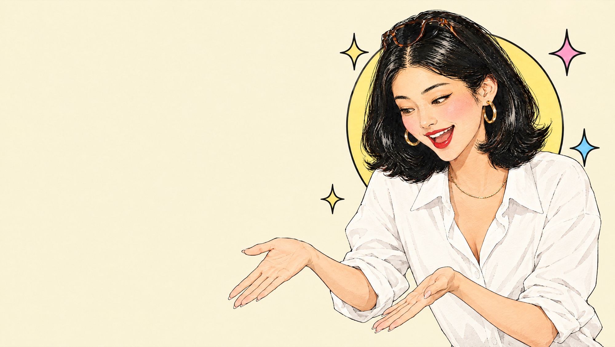
PresentingWeb hero. Points at products below.
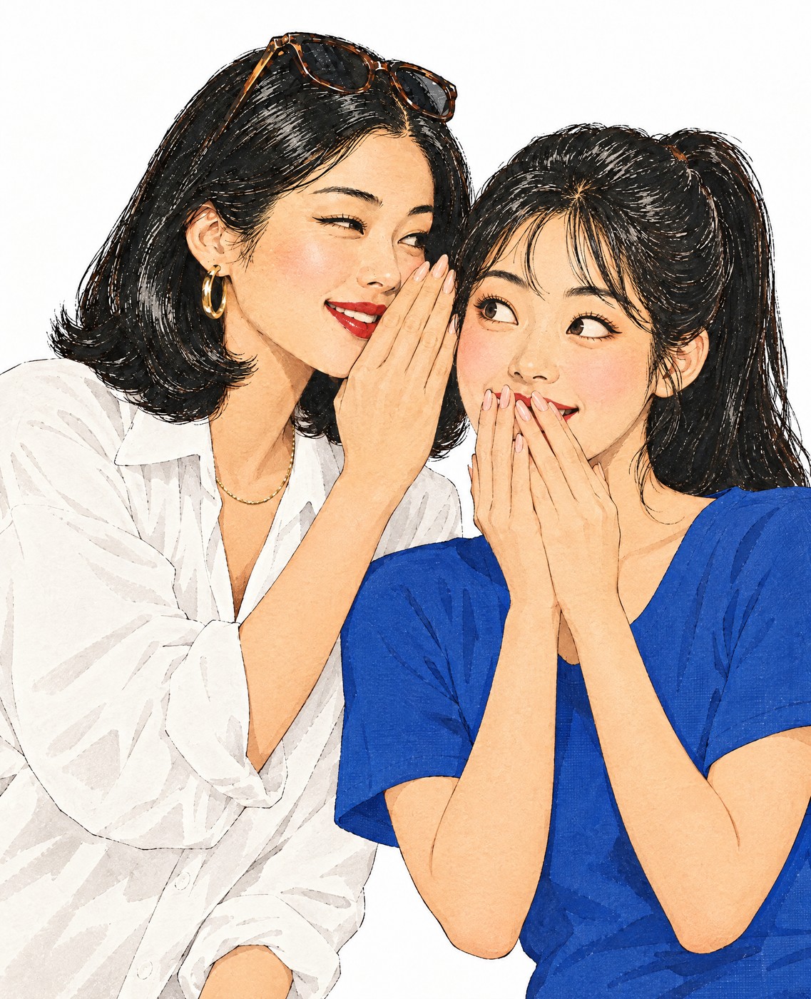
WhisperBrand story, “Meet Unnie”.
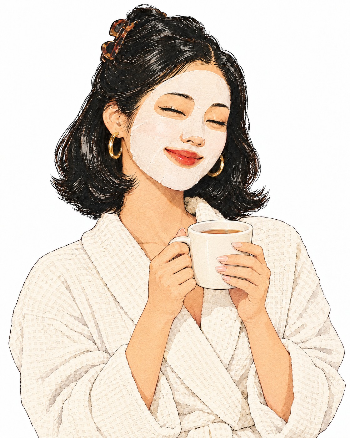
Tea breakHow-to, routines.
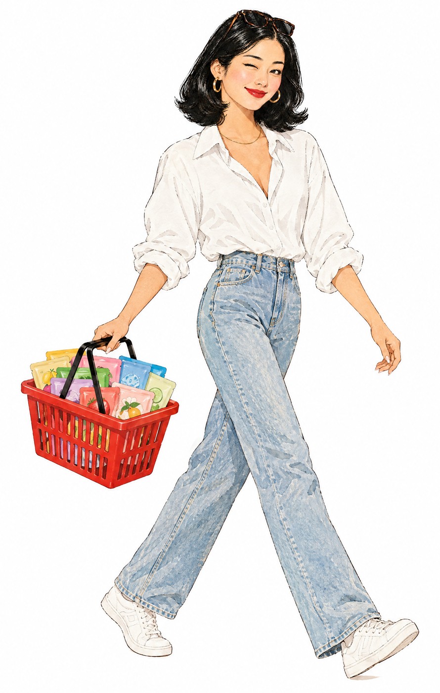
BasketShopping, launch posts.
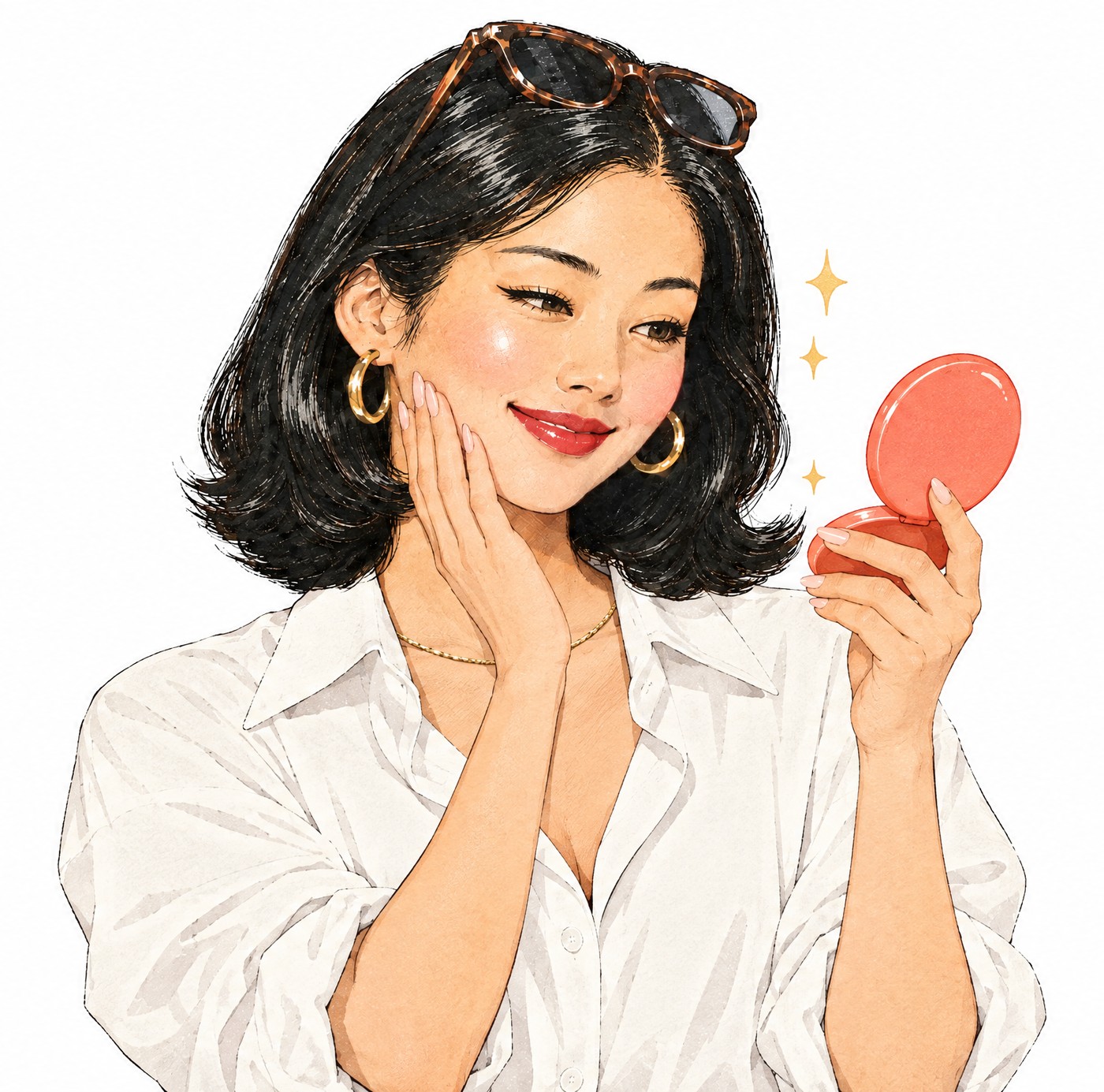
Glass Skin momentMirror check.
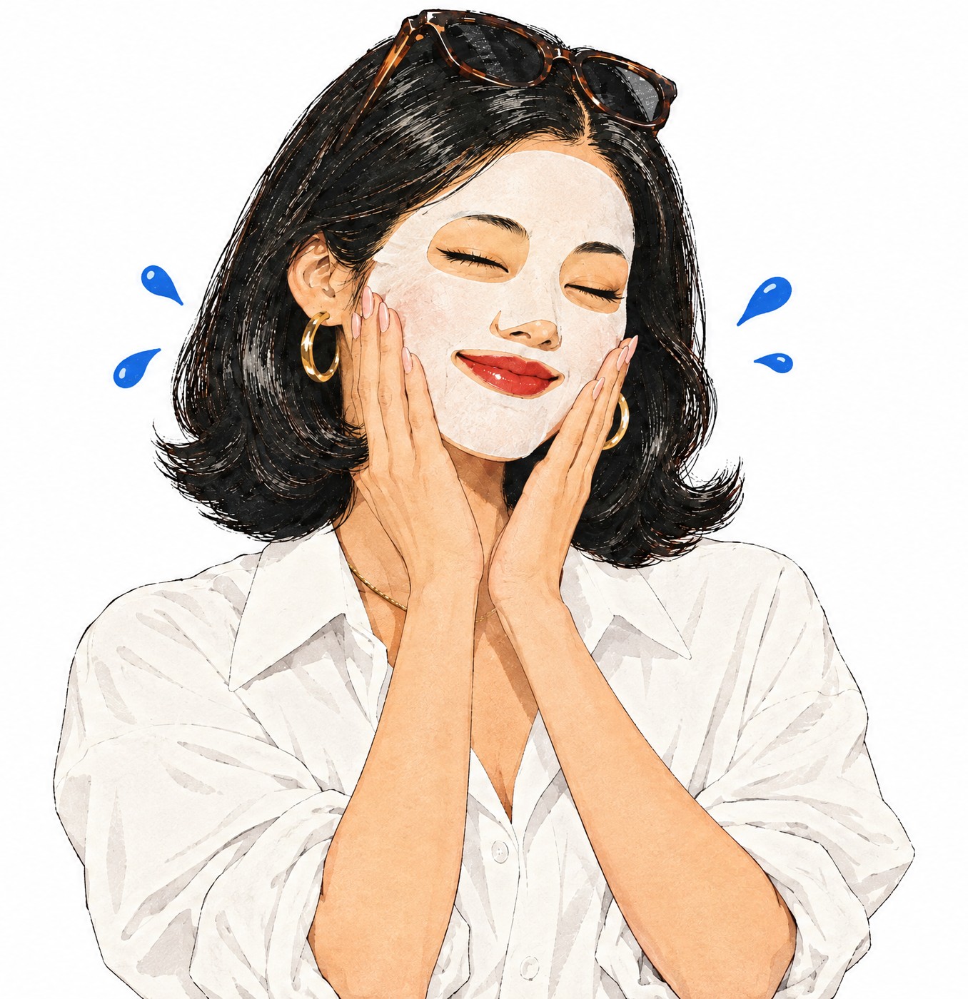
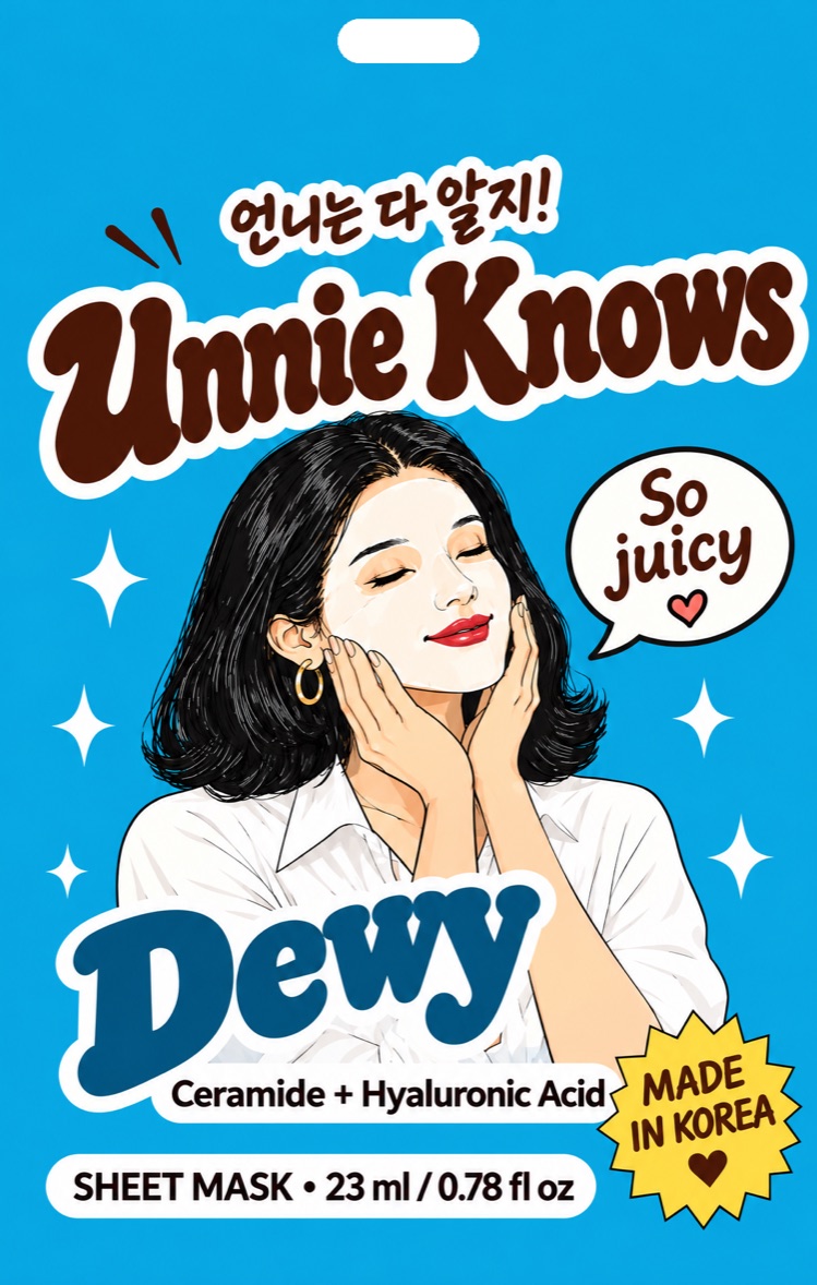
Dewy momentHands on cheeks.
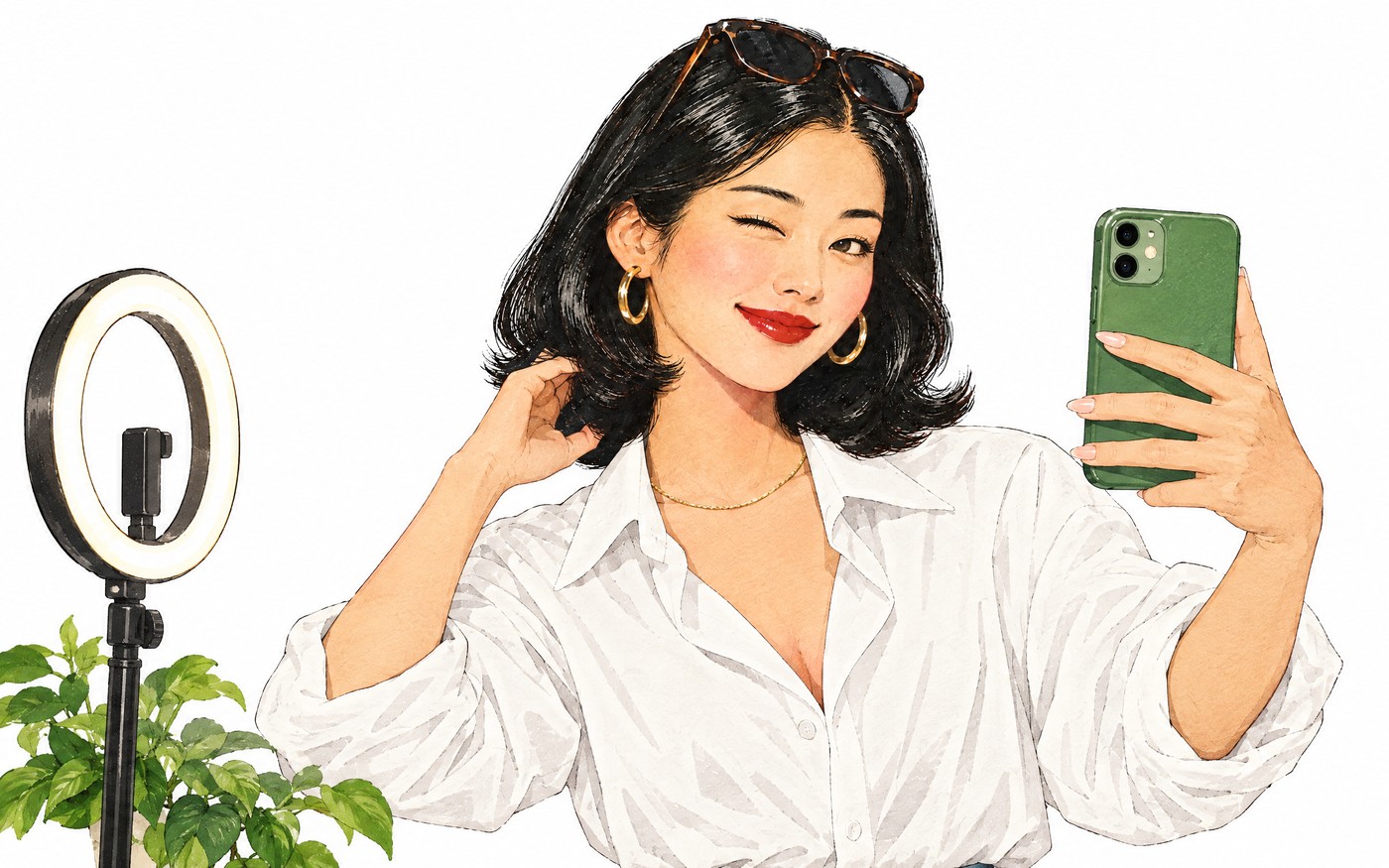
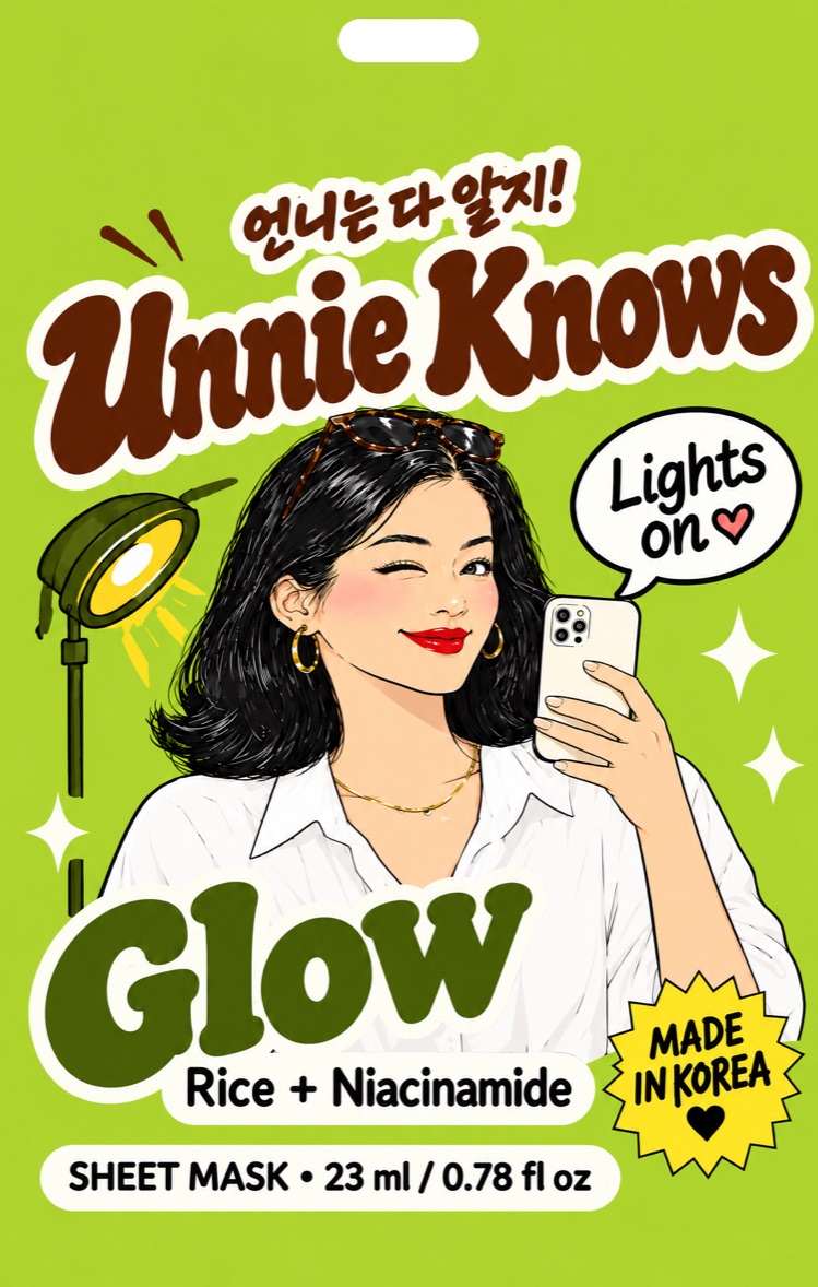
Glow momentRing-light selfie.
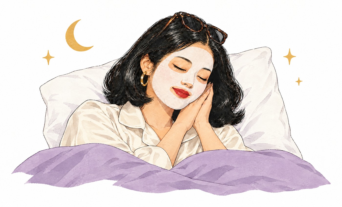
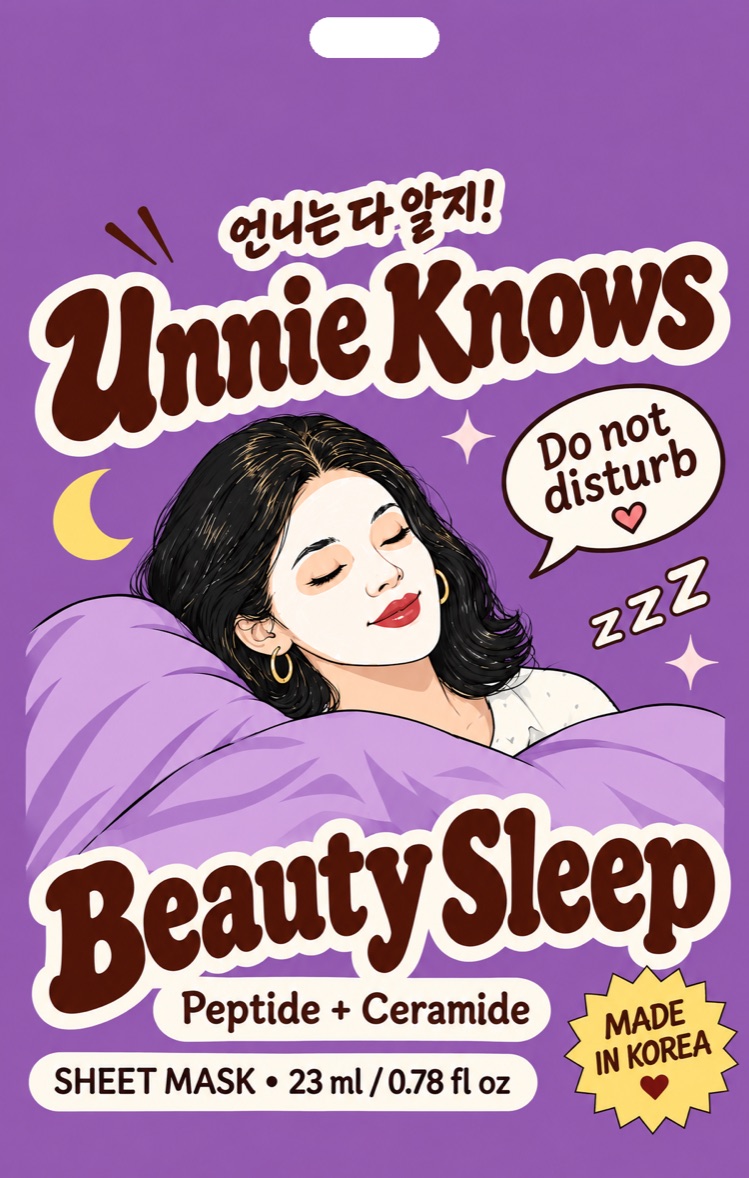
Beauty Sleep momentMasked, in bed.
Four reasons people reach for a mask, one SKU each. Every SKU owns a color, an Unnie moment, a line, and an ingredient pair. Keep those four things locked together.
“Glass skin era!”
Plump, bouncy, glassy. Lit from within in 20 minutes.
“So juicy.”
Deep hydration that is still there in the morning.
“Lights on.”
Brighter, more even tone. The Seoul rice trick, made real.
“Do not disturb.”
20 minutes before bed. Wake up looking rested.
One layout for all four SKUs; only the color, scene, line and ingredients change. From the end of the aisle it should read as a color block with a face.
1
2
3
4
5
6
7
8
Fill: 25 g / 0.88 oz. Use this everywhere (pouch, web, retail forms).
A small kit of retro print details. Use two or three per layout, not all of them.
2.5 to 3 px Ink outline, 6 px offset shadow down-right, no blur. Rounded corners 16 to 22 px.
Four-point stars with an Ink outline, in Butter, Blue or pink. Scatter two or three, never a pattern.
Unnie’s line in Yellowtail, tail toward her. Tilt 3 to 5 degrees.
Butter starburst with Ink edge. One per layout, lower corner.
Fully rounded, 2 px Ink outline. Ingredient pills take the product color.
Wine circle with ring text and 언니 in the middle. Works as an avatar or a small mark.
Like a big sister texting you: short, specific, a little teasing, always on your side. She names the ingredient and says what it does. She never oversells.
Glass skin era!Glass Skin
So juicy.Dewy
Lights on.Glow
Do not disturb.Beauty Sleep
*Only with real test results behind it.
Use only claims the formula testing supports, and only with the real numbers.
Keep price and store names off brand assets, so the same assets work for every retail partner. Add them only in retailer-specific pieces.
One short Korean phrase per piece, always with the English meaning nearby or obvious. 언니는 다 알지 is the house phrase.
Logos, pouch images, Unnie illustrations and color codes in one download.
Four transparent PNGs plus the original artwork.
logo/ full-color · wine · cream · black · originalFront of each pouch and the four-SKU lineup.
packaging/ pouch-* · lineupNine approved Unnie illustrations.
character/ wink · whisper · tea · basket · presenting · 4 scenesAll codes as CSS variables and JSON for developers.
colors/ unnie-knows-colors.css · .json